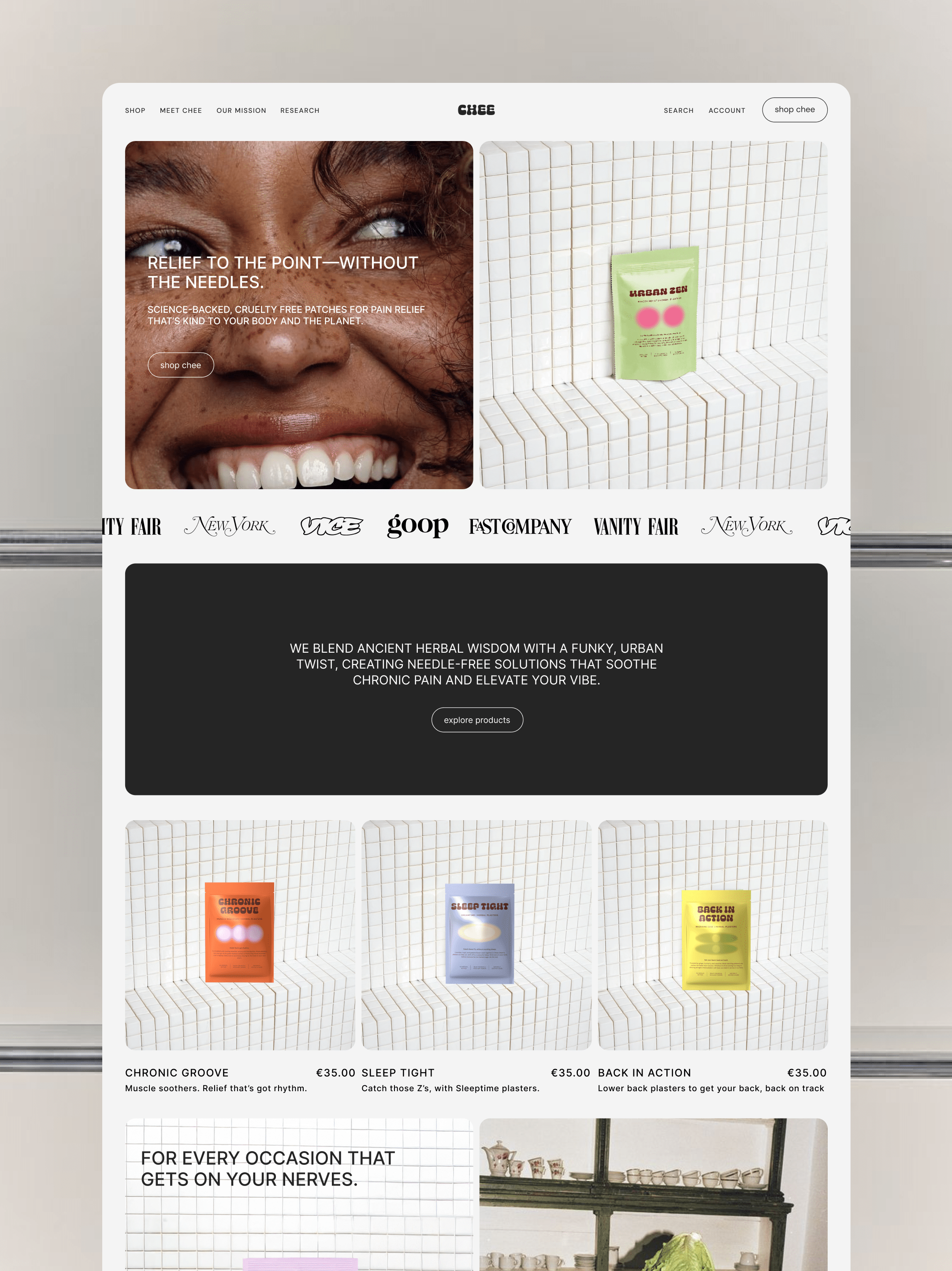
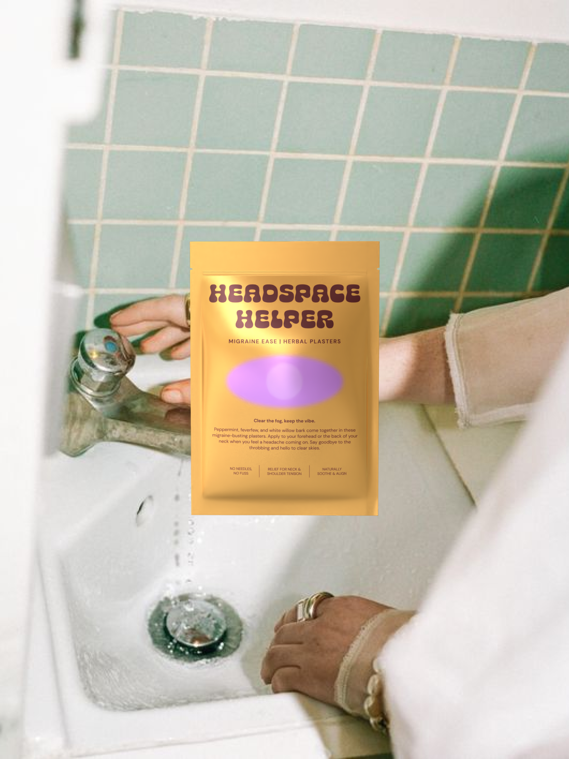
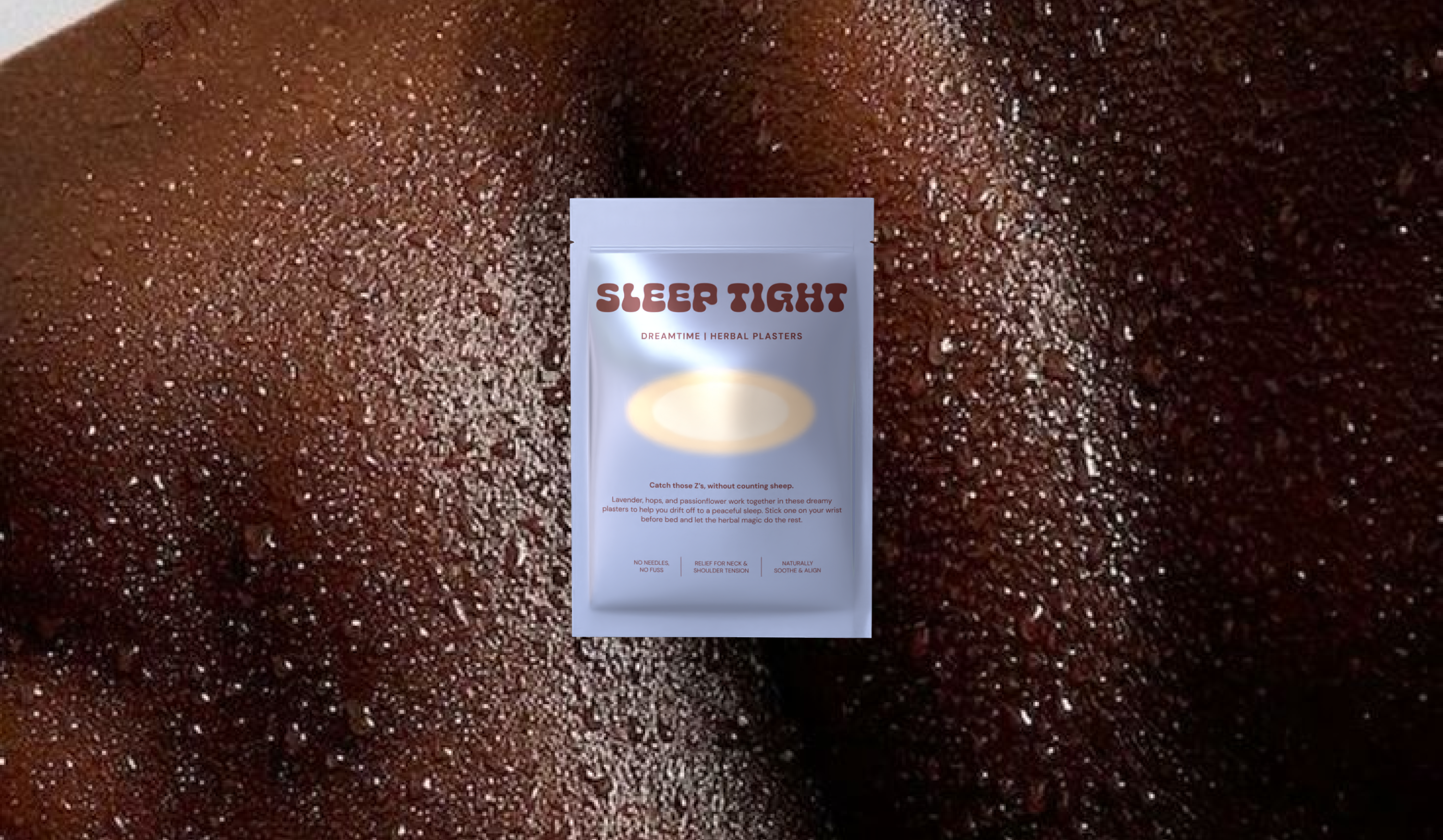
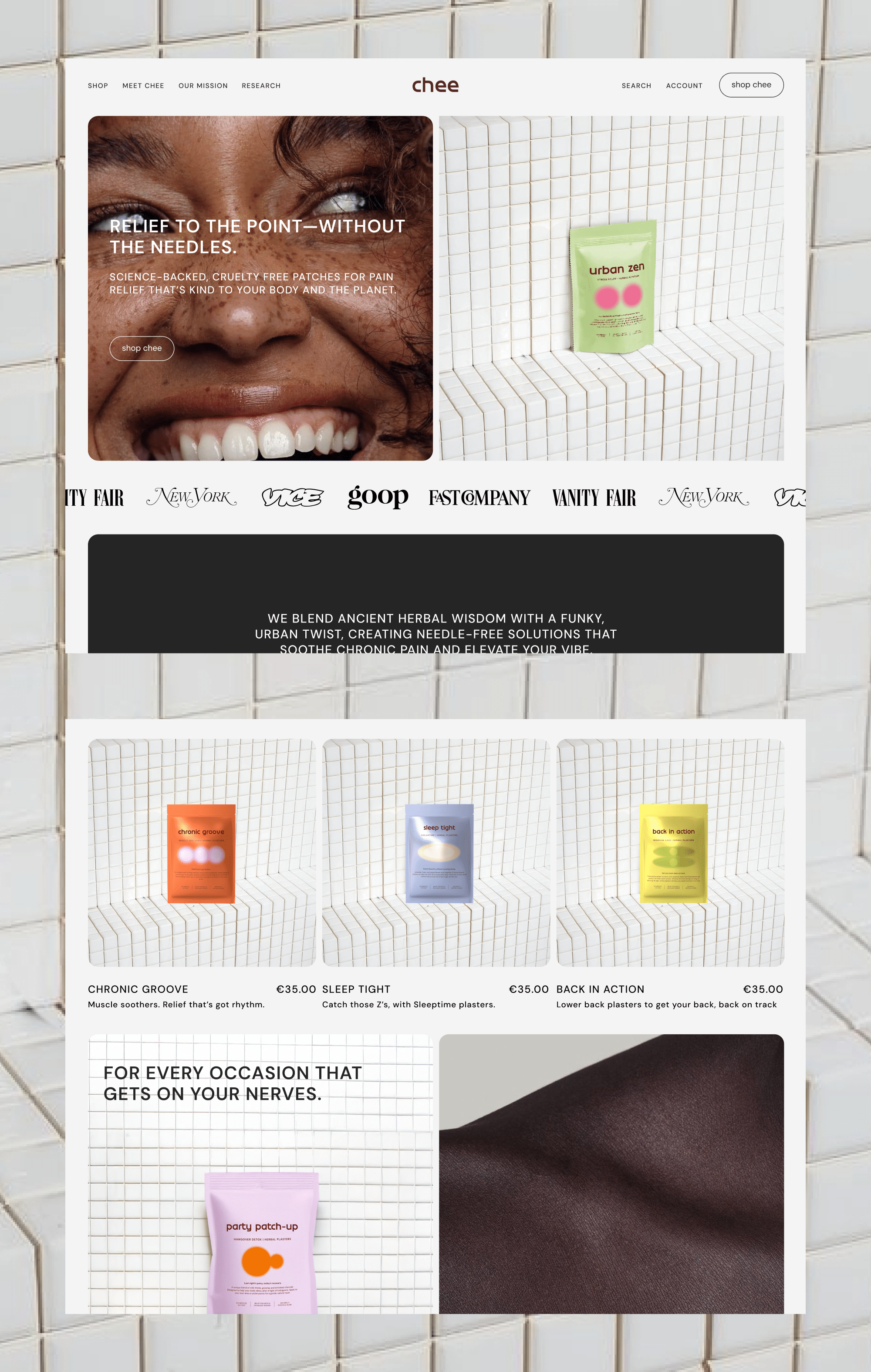
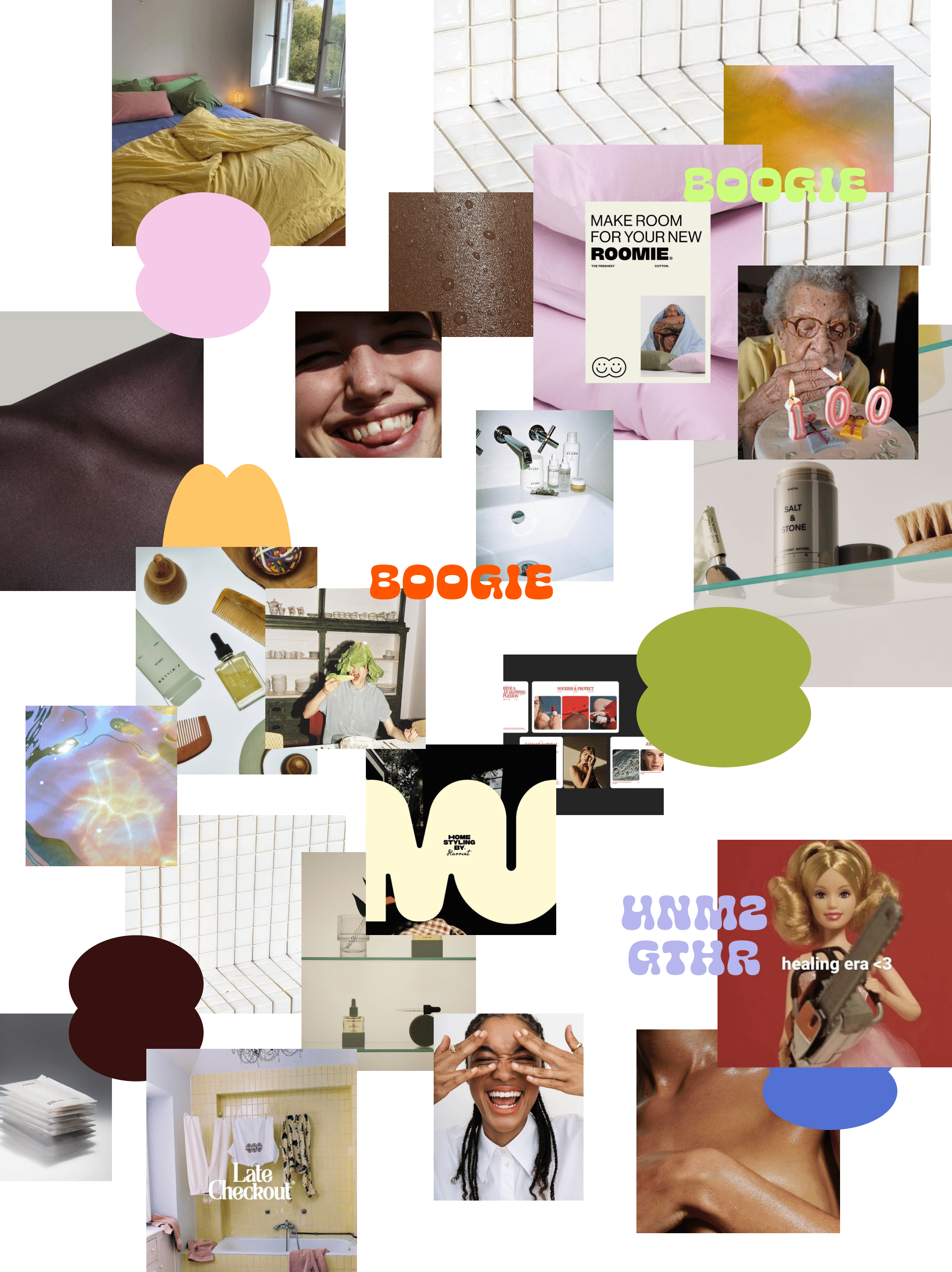
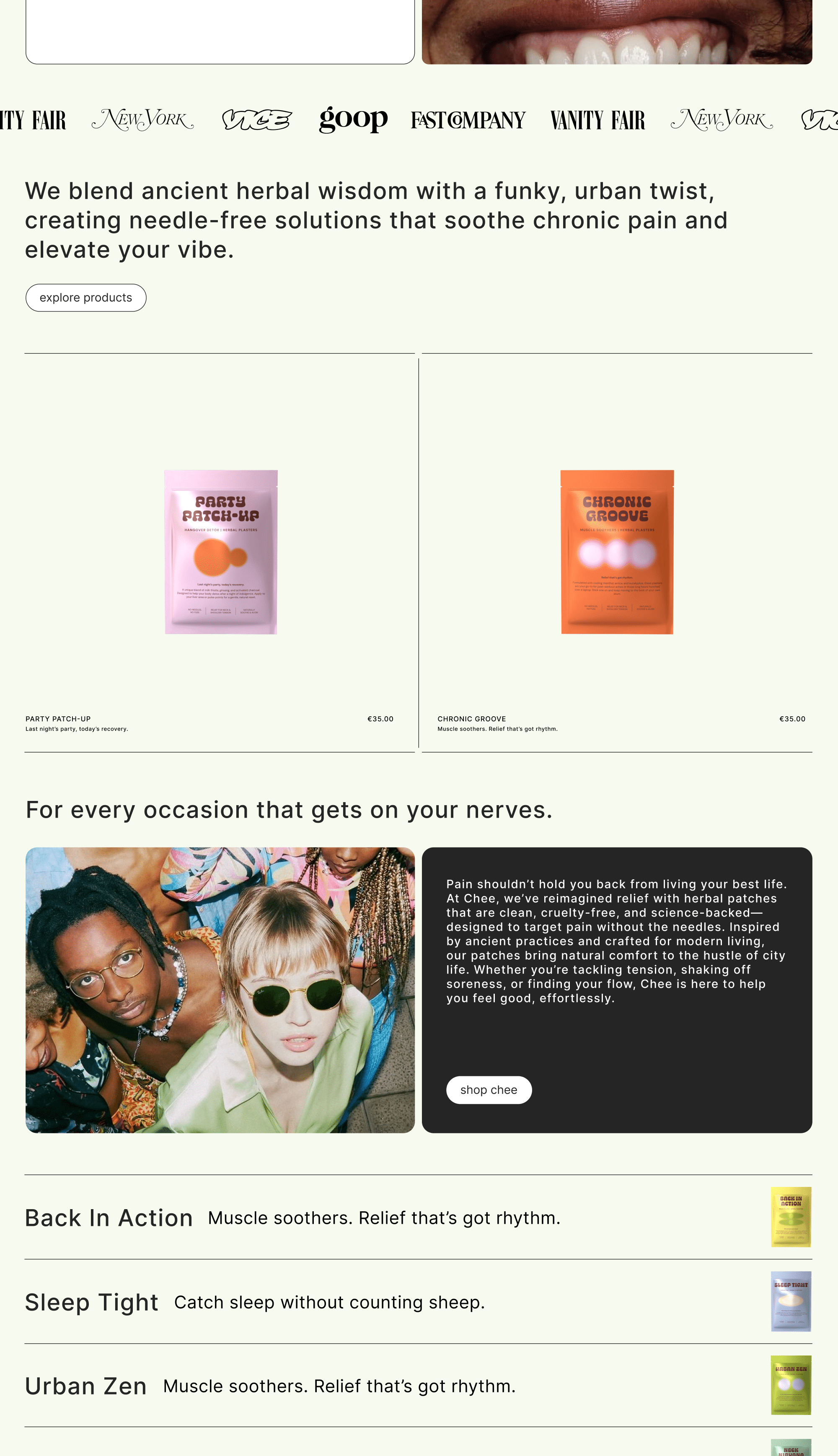
Chee is my take on shaking up wellness branding—because, let’s be real, it’s all starting to look the same. I wanted to challenge the overused minimalism and Gen Z aesthetics, and Instead, I built a brand that feels like a vibe: bold, nostalgic, and actually fun. Think 90s bodega energy meets modern self-care—bright colors, cheeky copy, and a funky font that makes slapping on an herbal patch feel less like a chore and more like a treat.
I came up with branding, packaging design, messaging and website design.
The result is a loud, punchy, and unapologetically extra brand that shows how, especially in the e-commerce space, brands must have a personality that needs to be and feel real.
*All photos are sourced from Pinterest
➔ WEBSITE, BRAND & PACKAGING DESIGN
➔ PASSION PROJECT
➔ ONLINE STORE | E-COMMERCE